
Light-painted Twilights
Enhancing twilight with light painting is a technique that takes a lot of time and practice. In fact, it can often take as long as one hour to shoot a single of those images and the post production takes at least as long.
So why only charge $50?
You see, I intend to become the very best twilight photographer in the Los Angeles market, and to achieve this, I absolutely need to get as much practice as I can. Given that there is only one time a day I can do twilights, I wanted to entice clients to opt for a twilight upgrade. Here are a few of my favorites of 2017 along with a few thoughts about what I have learned.

The main challenge in this back elevation was that the lot was quite narrow and the adjacent homes were not complimenting the contemporary style of this home, especially the building on the left, which was painted pink. The twilight format is helpful in those situations because the low light allows to hide unsightly elements. The square format helped, and I also decided to de-saturate both building as to have them draw as little attention as possible. I lit every room inside using a consistent light filter. That took a bit of time, but the small yard was painted rapidly, which allowed be to also include a front-elevation in the same photoshoot. Here it is below.
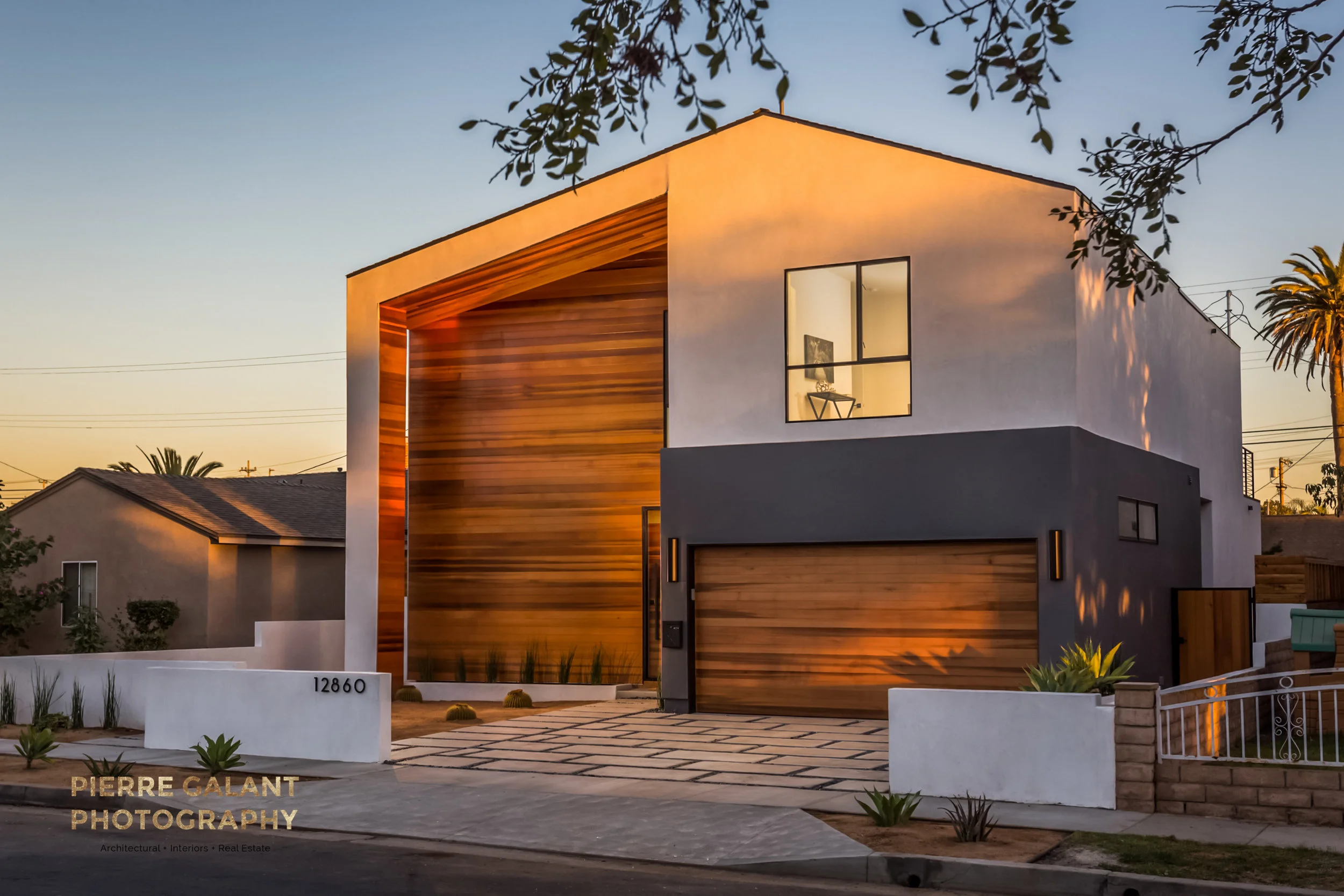
This front elevation is mainly lit by sunlight, as you can tell by the dappled side and the cactus shadow on the garage door. Due to the stark landscaping, I opted to go across the street and incorporate the silhouetted jacaranda leaves, which reminded me of a wall paper pattern. I also incorporated the palm tree on the left even though this meant that we would see the ugly fence next door.

The indented use of the image always informs the way I create an image. This is a vacation home. The architecture of the home was very simple, quite boring, really, but it was set in a secluded location on California's central coast. So I decided to minimize the importance of the house relative to the landscape while exaggerating the comforting warm glow coming from inside the home. The duality is repeated in the contrast between the manicured lawn and the lacy movement of the brushes and trees. I also liked the touch of the yellow flowers echoing the warmth of the home.

This is one of my favorite shots. Another photo rescue of an unsold listing that had terrible original images. The home owner had the idea to light up some candle lights inside which made the whole scene quite enchanting.

Here the challenge was to make an unfurnished house clad in 70's brown paint, more appealing. The answer was to incorporate a large pine tree in the front yard, but I wanted to do this is a way that would not worry prospective buyers about the proximity of such a large tree. So I framed the tree trunk out of the composition, and made the branches cover the sky as if it was a protective blanket. The added glow from the house and the open door really drove the point home that this is a safe and inviting place to live.

Ah! The Med Mansion! A really cool architectural renovation in Altadena. The pool had been a much later addition to the property and didn't really fit with the style of the home so I decided to show only a sliver of it, letting the viewers imagination take over.

This shot was all about leading lines, I took advantage of the wedge-shaped planter to suggest and arrow toward the home. I love the placement of the sculpture of a couple in love in the framed niche in the dining room. It was a subliminal nod to the happiness that might ensue from living there.

To finish on a high note, this home was published in Curbed LA, and one of the commenters said: "That backyard. I’m stunned. When I die, just throw my ashes into that back yard."
Realtor James Campbell on Embracing the Hollywood Hustle and Bustle
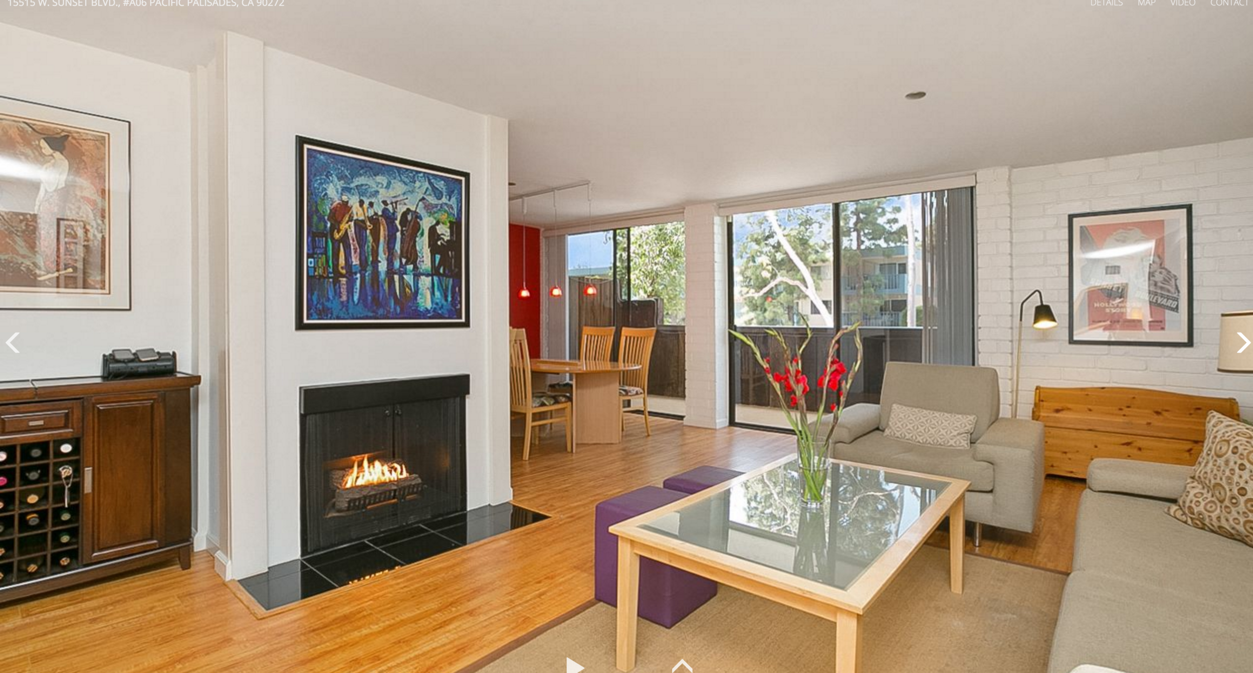
I met James Campbell when he tracked me down after seeing my work pop up regularly in the Los Angeles MLS. He had just landed a hip condo listing across from the Hollywood Bowl. My mission was to capture the essence of the dynamic and vibrant Hollywood lifestyle, to attract the right buyers, and to establish James as the go-to Realtor for future sellers in in the building.


The strategy worked.
Not only did it sell quickly and over asking, but the marketing caught the eye of a new seller who immediately hired James to market his unit. This time, we decided that instead of shying away from showing the busy street we would instead embrace it and feature the front of the building at twilight with the streaking car lights. Hollywood is a bustling part of town, there’s no going around it!

As a savvy marketer, James Campbell is a very active blogger in the Los Angeles Real Estate market, and he has a very interesting post on the different Photographers around the Los Angeles area, I invite you to check it out here.


Editorial Images for Real Estate.
We recently re-shot a home that hadn't sold.
Here is a side-by-side comparison that illustrates Pierre Galant's unique approach to Real estate Photography. By creating a narrative centered around geometry, flow and subtle details instead of merely documenting the space, our photography captures the feeling of being there, and centers around the humanity of the home design.
These results are best achieved with an initial consultation with the current home owners and the Real Estate Professional which re-visits the feelings associated with heir initial purchase of the home, those that came as a result of living in the space or as a result of the improvements that were done since.


The Case for Vertical Real Estate Shots
Some of my Real Estate clients insist on not doing any vertical shots. Their reasoning is that they do not display well on traditional real estate outlets such as the MLS and syndicated sites.
This makes sense to some degree, however, I believe this is a short-sighted perspective. While those sites are fine to sell the home itself, they do very little to build your brand image in the community. In fact, and that is a gripe of many Realtors, those sites aim to minimize the exposure of the listing agent. Often referring to the listing agent as a credit way down in the fine print.

This is how Trulia displays listing agent's information. That is after a lot of scrolling through neighborhood and market stats.
The screen shot here is from Trulia.com, and as you can see, the credit is displayed below your competition who is paying to have their info displayed right above your name! Even though you're the one who has paid for the images that are bringing the traffic there in the first place!
In response to this, many Realtors are trying to control their own marketing efforts, by using social platforms such as Instagram. That's where detail shots and vertical shots come into play.
You see, Instagram is a platform that was built specifically for being used on mobile devices. In the beginning, the only way to post images was in the square format so that it didn't matter in which direction the device was held.
Now that Instagram also allows for both landscape images and portrait images, they are able to measure the effect of the orientation on the level of user engagement. As it turns out, vertical, or portrait, images have much higher user engagement than square posts, and a much much higher engagement that horizontal, or landscape, images. This is because, a vertical image displays a lot bigger on Instagram than their horizontal counterparts, thus grabbing the attention of the viewer much more effectively.


As you can see, not only is the vertical image much more engaging and giving a much higher level of detail without forcing the user to tilt their device, but the scrolling down takes longer, meaning the audience is seeing the post for a longer period of time, and in the world of social media, even fractions of a second make a difference.
The 7 Deadly Sins of Real Estate Photography.
Why is Real Estate photography so notoriously bad? The seven sins below are the most common culprits we can find throughout the MLS.
Caution: After reading this post, you may never look at MLS images the same way again. You will cringe at what's out there, but you will now be able to have an educated discussion with your sellers about photography and why they should hire you to present their home in its best light.
DEADLY SIN #1- CROOKED VERTICALS
Unless you're listing the Tower of Pisa, the vertical lines in all your images should be straight. This actually is a very easy thing to correct in post processing, so there really is no excuse.

The image above isn't of the Mystery Spot, the wonky tourist attraction in Santa Cruz, CA. It is an expensive home in Los Angeles. The easiest thing to correct would have been the verticals. Instead, the home was listed several times and the price reduced, as you can tell from from the multiple MLS logos.
DEADLY SIN #2- UN-NATURAL WINDOW EXPOSURES
Sometimes, the value of the property is all about the views, so the temptation is to show the views through the windows as clearly as you can. After all, isn't the ability to show the views one of the main reason to hire a real estate photographer?

The reality is that the outside views are so much brighter than the inside. When a photographer tries to darken the view, the resulting view looks more like those 70's wall mural landscape posters. The exposure should be a little lighter than the outside. The color in of the outside should also look natural.
In the image below, the view looks way too dark and even though we live on a blue planet, I'm pretty sure this is an interpretation that is much too literal.

DEADLY SIN #3- NO SHADOWS or WEIRD SHADOWS
Did you know that most portrait photography techniques are named after the shadows that are created on the subject's face? That's because shadows are our friends. They create the mood, the feeling, of a photograph. Without them you get bland, flat images with no feeling at all.
Too many real estate photographers use a single powerful light from behind the camera, resulting is a nuked, unexciting image like the one below.
This next image, has been heavily processed and looks polished at first glance, however, this coffee table has 3 different shadows that come from the poor light-painting technique. How weird! (We'll talk about distortions such as the one you see on the armchair in Deadly Sin #7).

DEADLY SIN #4- BLOWN-OUT LIGHT FIXTURES
The human eye is naturally attracted to the lighter parts of an image, so nothing is more distracting than an overblown blob of light.
This image combines really bad composition, (the wide angle shows cell phones charging on the right and distorts the doorway) with a completely blown out light sconce on the left.

From the ceiling shadows, we can tell a flash was used, still that wasn't enough to overpower the yellow overexposed lights fixtures, and the result is horrendous.

DEADLY SIN #5- YOU CAN SEE THE PHOTOGRAPHER

Can you believe this image was actually used to market a million-dollar listing in Downtown Los Angeles?
Not every photograph is as bad as this one but almost as bad are reflections of tripods in shower doors or flash bursts caught in reflective surfaces.
The next image shows not one, but two flash bursts in the reflective surfaces of the artwork. That's not supposed to happen!
5- COLOR CASTS and MUDDY WALLS
When the blue light from outside blends with the different light sources inside, the resulting effect are often disastrous color casts that make the interior look like a candy store.
Above, is the kind of disaster that happens when the outside blue light gets mixed in with bold wall colors, and multiple artificial light sources.

I see blue, green, purple, orange, yellow.... None of which, I believe, were part of the original design.
Muddy walls, where walls literally appear to have been smeared with mud, also is a common problem. This is caused when a software tries to cope with blending all the different light sources, as you can see in the image below.

DEADLY SIN #7- ULTRA WIDE ANGLES
This is the single most important problem with Real Estate photography and if your photographer's only composition skill is to shoot at the widest angle possible, you're better off firing them. No one wants to live in a bowling alley! Add to that that the wide angles also greatly distort objects in the foreground and cause the ceilings to take up almost half of the image, and you have the typical bad Real Estate shot.

The photographer in this image managed to show all four (muddy) walls! This feat makes the whole room look like is is the in the shape of a stop sign. The oppressive ceiling takes up the top half of the image, and the floors take up the rest. Huge distortion on the dresser and wasted dead space on the left.
Below, is a great example of the bowling alley effect. One third of the image to the right is taken up by that grotesquely distorted table, and we hardly notice the selling feature of the fireplace far in the background left.

"But how else will you make the listing look bigger than it is?" you ask?
To which I reply, why are you over-selling the space? Do you really think clients will not notice the space is much smaller when they see the property in person? Instead, let's woo them by offering images that tells them how it really feels to be in the space,
THIS IS YOUR OPPORTUNITY!
Most of the images in this post were found on the MLS in late 2016, which is a sad state of affairs. Especially in a city like Los Angeles, which is famous for all the beautiful images it puts out into the world!
The "sins" listed above are not so difficult to avoid that only a wizard photographer can deliver decent real estate images, but they do take some learning, practice, time, and care to execute.
I strongly believe it is up to the Realtor community to demand higher standards from their photography vendors. In fact, I believe that those very low standards are contributing to an amateurish perception that is hurting the whole industry.
Until that happens, this is your opportunity to truly stand out from your competitors. In a digital world, your images are your shop's window. They should be the best. They are a direct reflection on you, your professionalism, your attention to detail.